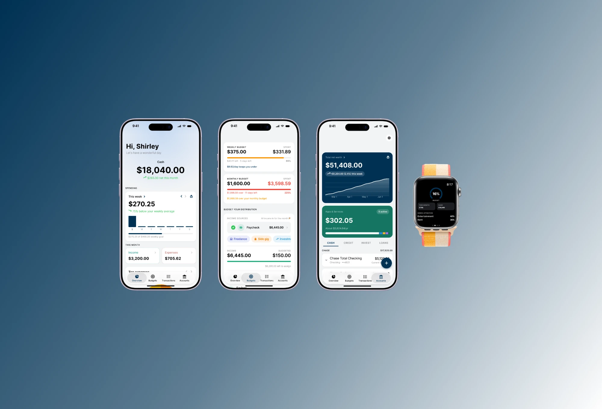
MizuFlow
Download on theApp StoreReducing financial anxiety by the second.
Finance tracking apps made me anxious, so I built one that doesn't.
My peers and I feel overwhelmed and anxious everytime we opened an existing finance tracking application. I'm a young adult, fresh out of college, and it's a vulnerable time to begin financial transparency. However, using these platforms made me feel more shame than relief.
Here's what I ran into:
- Harsh red numbers made checking my balance feel like bad news, so I avoided opening the app
- Tons of sections buried the one number I just wanted to see
- Email & push warnings for buying groceries and paying bills
- Three friends felt the same way, and one said, “It felt like the app was judging me”
So I answered each one, and the journey was an amazing learning experience. Let's get into it.
Everyone was stressed about the same thing.
There's already so many other platforms, so what was the point of competing with them?
Shockingly, there were so many areas to improve on. I studied how people talk about money apps through interviews, forum threads, and app-store reviews.
The complaints varied but they had the same theme.
Wait... This might be harder than I thought
Even though there were many flaws in the competitive market, it began to feel difficult to build a platform someone is willing to pay for.
My closest family & friends didn't support the idea either and suggested I direct my focus to a different platform...
But I didn't want to give up. I had a good feeling. I wanted to put my all into this, and I didn't want to stop before I even tried my hardest.
A target group to expand into
I dove deeper into the research and found a group of target audience that manually tracked their finances. I found a new friction, and this was a space for MizuFlow to stretch into.
Notes & spreadsheets are a common practice to track your money, but busy parents & workers don't have enough time to do this all the time. They needed something instant, so we built a system that can detect their income.
Intentional design decisions & thought process
Lots of attempts, iterations, long nights, and bottles of Red Bull to keep me awake. I felt incredibly passionate to complete this, to fight for what I believed for, and to make a financial tracking experience feel delightful and intentful.
Going deeper on the details
A few features that should take the spotlight.
Cards
Transactions
Transactions should be the easiest feature to analyze and filter through.
Click a transaction to see its budget and history.
- Client paymentIncome+$1,250.00
Blue Bottle CoffeeSavings-$5.75
SweetgreenSavings-$14.20
 Whole FoodsSavings-$78.50
LyftTransportation-$12.60
AMC TheatresGeneral Merchandise-$23.00
ChipotleSavings-$14.30
- Whole Foods4 transactions$335.10
Whole FoodsSun, Aug 2, 2026Looks recurring-$78.50Unclear charges? We ask.
Not all charges can be self-identified.
Instead of assuming, we send those as a small swipe deck and each choice reflects upon your analytics.
 Venmo from Alex+$45.00
14 testers, and two requests I couldn't ignore
14 testers used MizuFlow and told me what worked and what was missing. The feedback was encouraging:
- Launch page and onboarding animations was a favorite first-time experience
- The UI felt smooth and clean, which was the goal after how overwhelming other platforms felt
- Analytics was one of the features they didn't think of, but realized they needed
- Two requests:
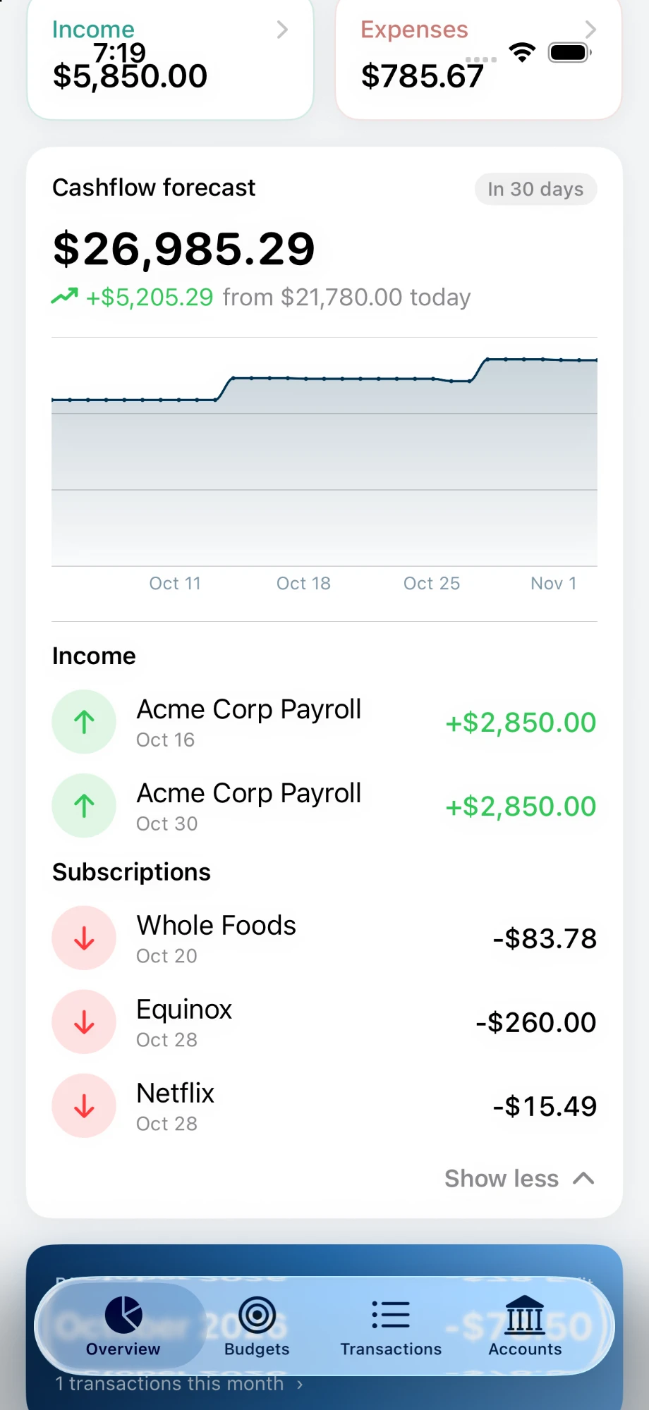
- Cashflow forecast: see where their next month's money is headed based on previous data
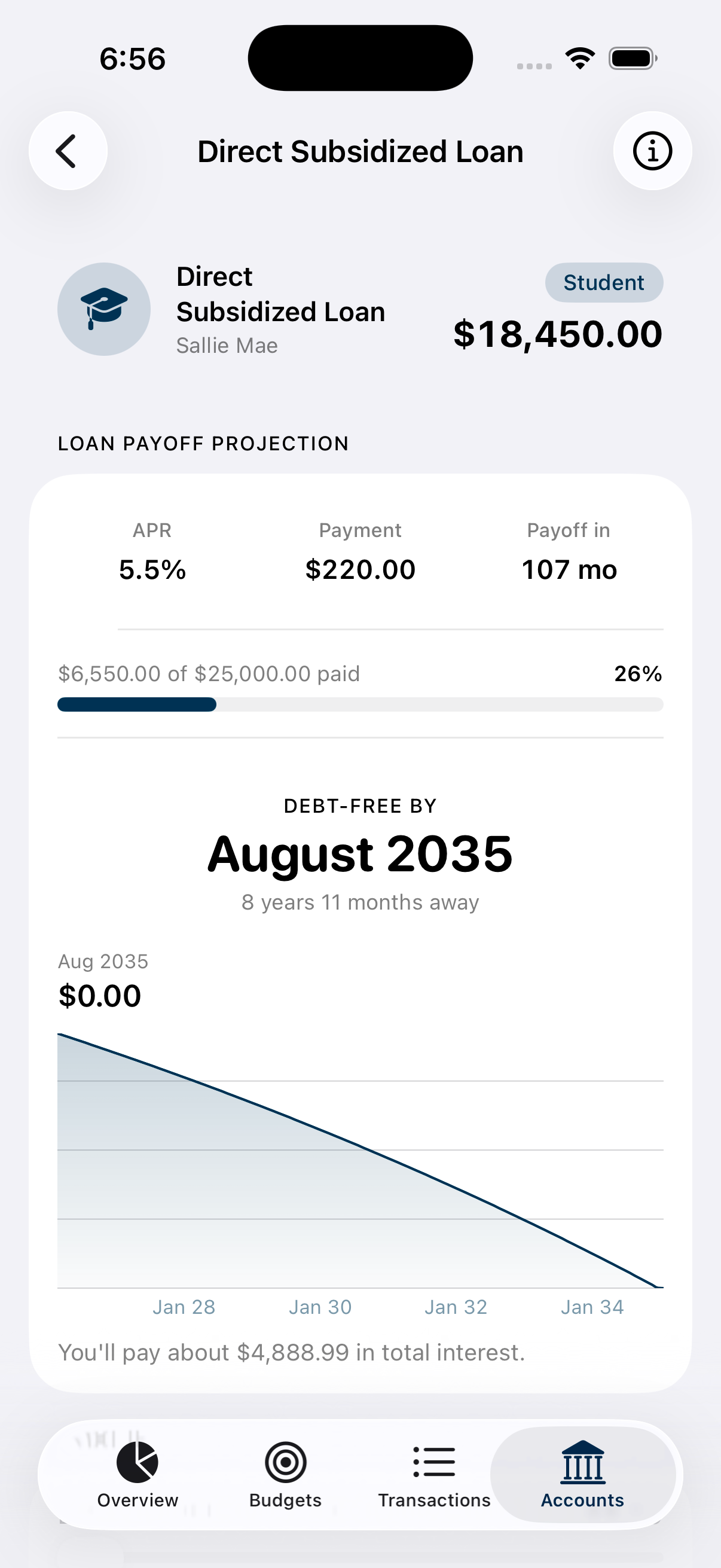
- Loan payoff timeline: understand how long it will take to pay off their debt
A proud moment
The two screens I kept refreshing for:
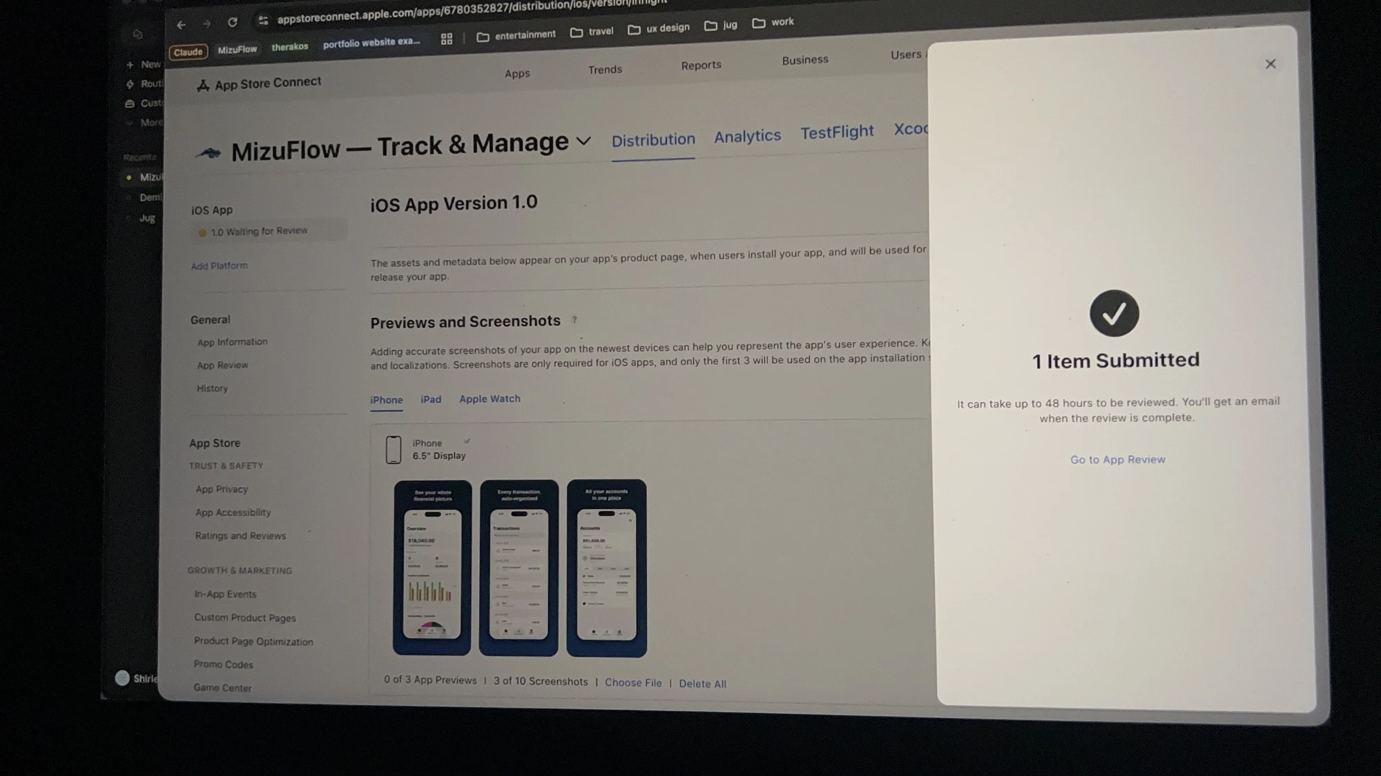
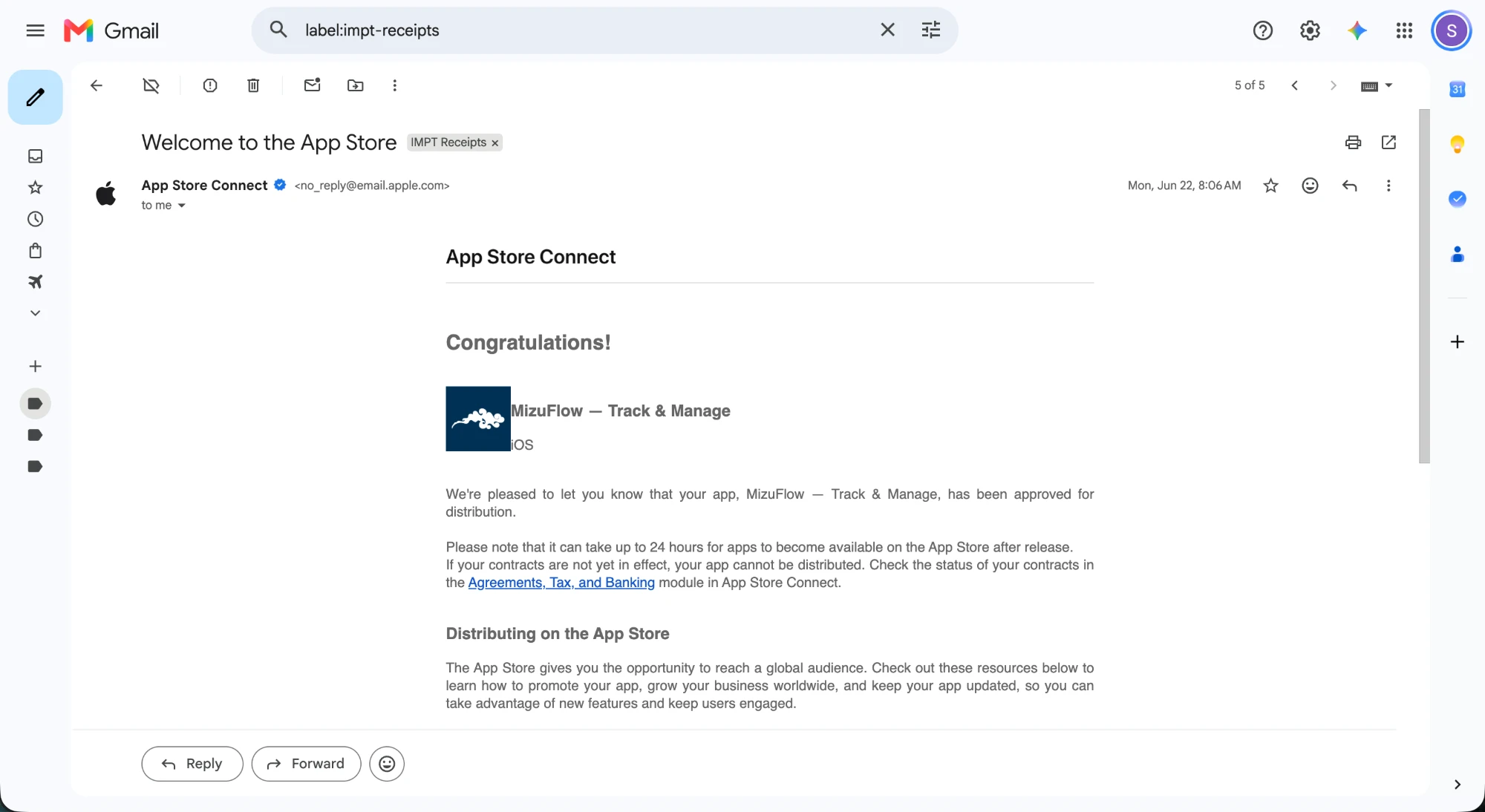
My first platform shipped solo.
Wow, we're finally here. Lots of blood, sweat, and tears were put into this. The first platform I've shipped solo, and I am so proud of myself.
As a product designer, I learned so much about designing in the target audience's shoes. My first paid user made me feel so complete and successful, I felt like a millionaire, not financially, but as a designer.
Building is 10% of the challenge
Understanding my audience through analytics to continue improving and iterating both my marketing efforts and features was a hard obstacle.
I wanted an organic crowd to prove this was a solution to some folks.
Alive and not static
Haptic feedbacks, notifications, and motion design, and many more.
Not only does UX focus on the user journey, but to make it feel alive and humane is just as important.
Just launch & keep on iterating
It's difficult to know if it's ready to ship, but it'll never be ready.
To continue iterating and improving is how the user can feel heard.
Since launch, I've shipped out 11 builds consisting of new features, designs, concepts.
What's next: more depth, not more screens.
The next stretch is less about new screens and more about depth.
- Android releaseSo the app isn't iOS-only.
- VoiceOver supportFor hands-free use.
- Dynamic TypeScaling numeric screens instead of locking them into one text size.
- Color-independent statusIcons and text alongside every color cue so that budget rings and urgent status are not the only immediate signal the user reads.